
 Medialab-Matadero Madrid
Visualizar'09 - Selected proposals
Projects:
Hidro status of now
By Keyvan Minoukadeh and Katrin Caspar
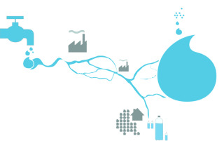
The project aims to visualize the amount and use of water based on regions and their resources. Where do we get our water from? How are we using it? And how much are we using? (How much water are we wasting day by day?) How about the quality? Is it so clean that we can drink it, straight from the tap? What are the regional differences? How about the global distribution?
> Find updated information in the Wiki.
The evolution of innovation. A visual history of patent registrations during the last decades (La evolución de la innovación. Una historia visual de los registros de patente en las últimas década)
By Leonardo Solaas
Our purpose will be to design and build a tool that enables the exploration and understanding of the scientific and technical development process over the world during the last decades.
Our material will be the patent registration data of the United States, which is an abundant and homogeneous data body documenting an essential aspect of technological innovation, not only in that country, but in the world at large. Since this is a well-studied field, we will be able to support our work on existing databases and methodological studies.
The idea is to implement text and citation relationship analysis tools, as means to identify tendencies over time and influence relationships. After that, we will develop one or more interactive visualizations that let the users navigate the recent history of inventions in a fluid and dynamic way, bringing into view the salient characteristics and large-scale regularities of this huge and difficult to tackle data body.
> Find updated information in the Wiki
The piratepie.org
By Mar Canet, Jaume Nualart, and David Stolarsky
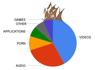
How much is piracy hurting the music and film industries? Do pirates have better taste than legal consumers? What can you pirate in the first place? The Pirate Bay, facing death by Swedish court, recently released their 20GB torrent database as a single download. hus, we may be creating a eulogy for a once great hub of piracy.
During Visualizar, our project will have three phases. First, we will brainstorm the questions this data could (visually) answer. Second, we will code prototype visualizations relating to as many of our questions as possible. And finally, we will decide which questions have the most beautiful, stunning, surprising, or elegant answers, and we will build polished results. The results will of course be visualizations—whether interactive, print, animation, or otherwise—and will be delivered at the end of Visualizar and on ThePiratePie.org.
> Find updated information in the Wiki
What do they have? Alternate Visualizations of Museum Collections
By Piotr Adamczyk
Museums are increasingly adopting open data policies, both for easy internal reuse of data sets and as a way of building community engagement online. While the opening up of data is a welcome development, too often key audiences see too little of this information through too small a keyhole. As linked and open data formats and Application Programming Interfaces become more common for cultural repositories, providing a sense of the scope and shape of museum collections is moving from a problem of data access to one of presentation.
This project will develop a set of visualizations appropriate for aggregate museum collection metadata, but with an eye to answering different questions than most museums currently address online. Focusing on the two dimensions most likely to be available in museum metadata, time and space, the visualizations will try to convey the sense of place and ascribed cultural value over time as represented in collections.
Visualizing public data about (global) cultural heritage can suggest how one culture sees another and lead to a more open discussion about how the story of public culture is being told.
> Find updated information in the Wiki
New Political Interfaces (Nuevas Interfaces Políticas)
By Cristóbal Castilla and José Hernández

In a broader sense, the study intends to question if society is participative and competent enough to prescribe its own political content.
> More information in the Wiki
Kultur-o-meter
By Atravesad*s por la cultura
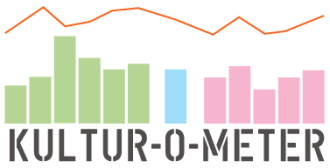
The Kultur-O-Meter project aims to create an on-line tool enabling the visualization and analysis of the most significant numerical parameters of cultural production in Madrid. As part of the research, a preliminary study of the fundamental variables will be conducted. The tool will make it possible to show data the accessible to the public and also data that could not be obtained, thereby demonstrating the degree of transparency of each institution or cultural event.
The proposal is structured in three stages:
- Gathering data. Systematization of documentation. Methods for data gathering and sources of access to data. Methods for assessing institutional transparency via the accessibility/opacity of data.
- Data interpretation axes. Structuring and ordering of data obtained (or inaccessible data). Establishing study fields, such as: types of contracts, finances and expenditures. Analysis of Madrid’s productive institutional structure.
- Data visualization tool. Map of accessible data. Map of blank areas. Grey areas.
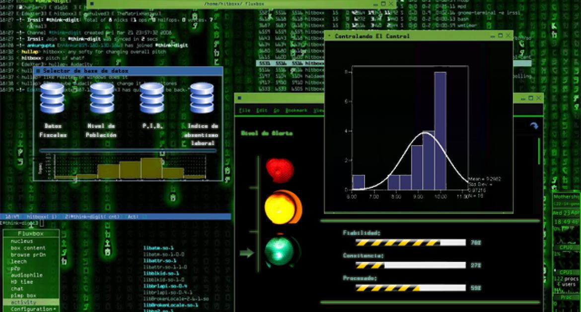
surveillance under control
By Jonás Fernández Reviejo, Víctor Rodrigo Gudiel, and Miguel Valero Espada
This tool aims to serve as a warning for information contained in databases. To do so, it uses Benford’s Law, a law of statistics providing information about the expected appearance rate of certain figures related to the first digit of large amounts. Specifically, it states that the number 1 appears more frequently than number 2, 2 more often than 3, 3 more often than 4, and so on up to 9, which is the least frequent first digit. These large amounts are found in everyday life in invoices, budgets, gas emission percentages, election participation, etc. and they follow Benford’s Law, which thus serves as a mechanism to detect fraud in elections, budgetary data, and so on.
The project will be divided into two stages: the first will be devoted to processing information from databases. That is, the data will be parsed and then interpreted according to Benford’s Law. In the second stage, the data will be visualized.
El proyecto se va a dividir en dos etapas: una primera destinada al proceso de la información procedente de las bases de datos, o sea, parseo de los datos más interpretación a través de la ley de Benford, y una segunda etapa en la que se procederá a su visualización.
> Find updated information in the Wiki
The River Project (Proyecto Ríos)
By Asociación Territorios Vivos (ATV)
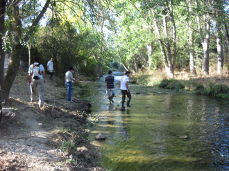
Proyecto Ríos (PR) (The River Project) is an initiative carried out by the Asociación Territorios Vivos (Living Territories Volunteer Association). Its main purpose is to stimulate society’s active participation in river preservation and improvement, through fostering environmental volunteer activity based on groups of volunteers who inspect river sections, gathering data on the rivers that reflect the degree of health in the ecosystem and its evolution over time.
The River Project generates a set of physical, chemical and biological results that we believe are of interest to society. Our interest in Visualizar'09 is the following:
- We consider that publicizing The River Project is beneficial to reach more sectors of society, attain a larger number of volunteers and enable ties to various social agents.
- We think that the data generated can be visualized in a way society and the public at large find appealing, which will serve to increase public interest and concern about rivers, their problems and preservation.
- We consider it essential that our volunteers’ efforts in gathering data on rivers be translated into creative initiatives that serve as incentives to increase their motivation and involvement in The River Project.
> More info in the Wiki
FLUflux
By Jihyun Kim and Andrés Colubri
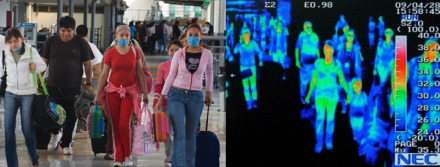
The ongoing pandemic of influenza A (H1N1) occurs in the context of an interconnected world where large numbers of people quickly move from one country to another. Many factors - social, geopolitical, economical, etc.- affect and are affected by the flux of tourists, immigrants, temporary workers, students, and refugees traveling between different parts of the world. Global pandemics are an unexpected and potentially disruptive factor that arguably alters the configuration of these networks of global mobility. There are various online data repositories for both influenza A statistics (FluTracker, HealthMap) as well as border crossings and entry activities for different countries (Tourist database at UNdata, US Aviation data library). The goal of this visualization project is to mine, filter and visualize these two sources of data in such a way that time and location correlations between them are made visible and open for discussion. The project will have a web-based interface as well as a physical installation form, and both will be updated in regularly to reflect the evolution of the pandemic.
> Find updated information in the Wiki
Invited project: In the Air
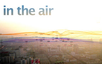
In the Air was developed in its first stage during the last last Visualizar edition (Visualizar'08: Database City), dedicated to data visualization applied to the city context. The project was developed with the collaboration of Guillermo Ramirez, Carlota Pascual, Greg J. Smith, Victor Viña, Raphaël de Staël, Paco González, Miguel Vidal, Susanna Tesconi, and Sandra Fernández.
The project aims to visualize the microscopic and invisible agents in Madrid’s air (gasses, particles, pollen, diseases, etc.) in order to match their behavior, their reaction and interaction with the rest of the city.
The following lines of work will be developed:
- Scientific tool. Incorporation of new data on the city and climate. Real Time data, historical data, etc.
- Social tool. Decision-making promotion by creating a game. Visualizing the action’s effects. Competence. Consequences in the city.
- Network of cities. Development of the application for its application in other cities. Comparative data, platform, local specifity.
- Production of new data. Development of sensors that produce independent data and incorporate it to the application. Simultaneity of divers data.
- Exterior visualization. Development of external visualization devices. Alternatives to “Diffused façade”.
More information: www.intheair.es
> Find updated information in the Wiki
Papers:
- Recorrido horizontal por el “estado del arte” de la visualización digital - Alfonso de la Fuente Ruiz
- data404: producir, liberar, remezclar y representar la información pública - Xavier Belanche Alonso
- Evidence-based policies on copyright and public data: hypotesis, data, norm and law - Javier Candeira
- Closing the circle - Paolo Battino Viterbo and Valentina Barsotti -
- Imagining behavioral change Smart meters and data visualizations of energy consumption - Jan-Christoph Zoels
With the support of the Spanish Foundation for Science and Technology - Ministry of Science and Innovation (FECYT - Ministerio de Ciencia e Innovación)

